
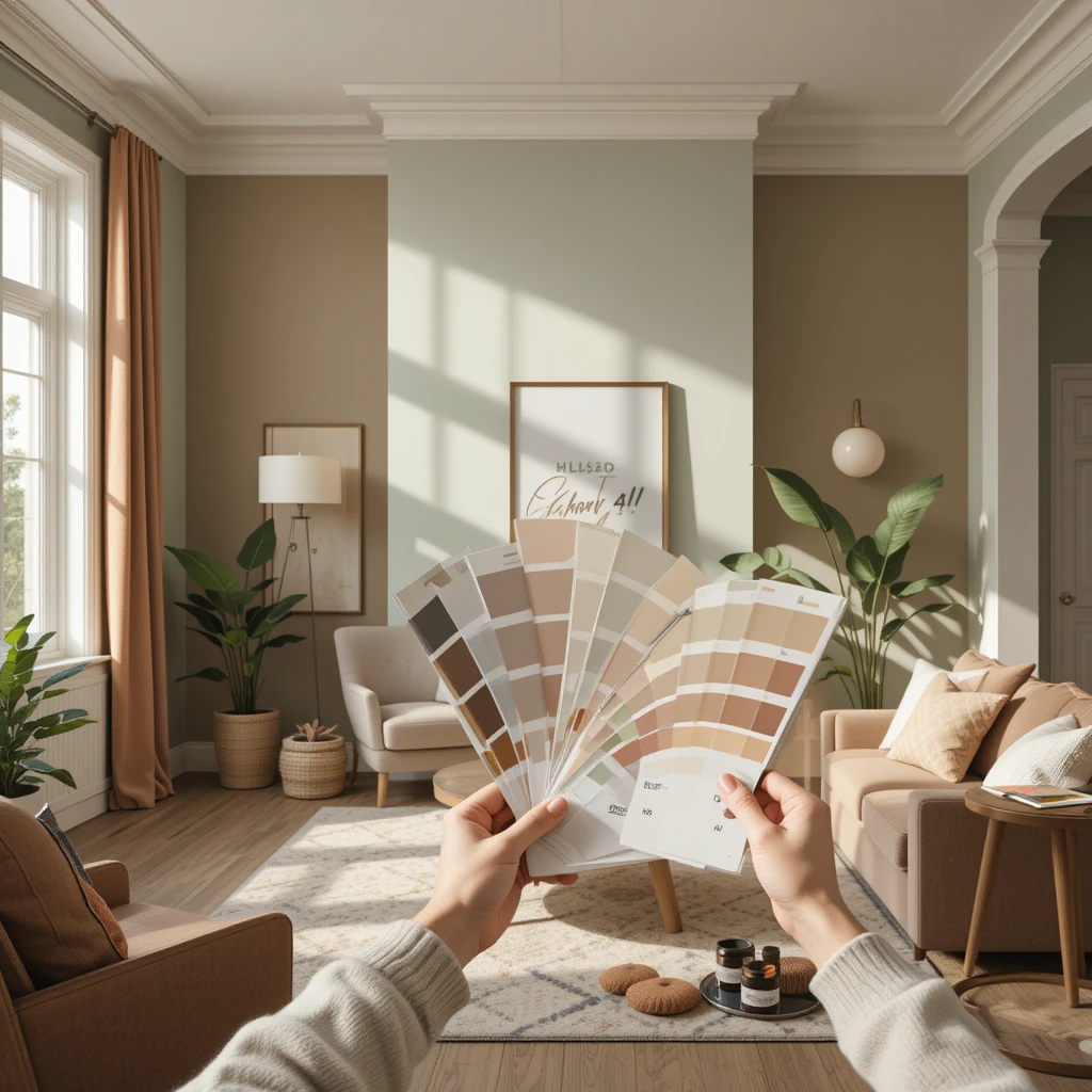
How to Choose Paint Colors for Your Home: The Ultimate Guide

Choosing the right paint colors for your home can feel overwhelming. With countless shades, finishes, and palettes available, how do you decide which color will transform your space perfectly? This comprehensive guide will help you master the art of how to choose paint colors for your home, ensuring you create a beautiful, welcoming environment tailored to your style.
Whether you’re repainting your entire house or just one room, understanding the principles behind best paint colors for home interiors and how to pick wall colors is essential. This article will cover everything from color psychology for home decor to lighting effects, so you feel confident in choosing the right paint shade every time.

Why Is Choosing the Right Paint Color Important for Your Home?
The color you choose for your walls influences not just the look of your home but also the atmosphere and how you feel within it. The right paint color can make a small room feel spacious, create a cozy ambiance, or energize a space for creativity and productivity.
Selecting best paint colors for home interiors isn’t just about aesthetics — it’s about functionality and mood. Paint colors have a powerful effect on your emotions and can affect everything from your energy levels to your ability to relax. That’s why learning how to choose paint colors for your home thoughtfully matters.

What Factors Should You Consider Before Selecting a Paint Color?
Before you pick up a paintbrush, consider these key factors:
1. Room Size and Natural Light
Large rooms can handle darker shades better, while small rooms often benefit from lighter colors to make them feel more open. Natural light changes how paint colors look, so observe your room at different times of the day.

2. Existing Furniture and Decor
Your walls should complement your furniture, flooring, and decor. Think about the dominant colors and textures already in the room when choosing the right paint shade.

3. Mood and Purpose of the Room
The color should reflect the room’s purpose. For example, calming blues and greens are ideal for bedrooms, while vibrant reds and yellows may energize kitchens or playrooms. This is where color psychology for home decor comes into play.

4. Finish and Paint Type
Matte, satin, semi-gloss, or gloss finishes all affect the final look and durability of your paint. Choose the right finish based on the room’s function and your cleaning preferences.

How Do Paint Colors Affect the Mood and Ambiance of a Room?
Color psychology explains how colors influence emotions and behaviors. Here’s a quick overview of how common paint colors affect mood:
- Blue: Calm, serene, and trustworthy—ideal for bedrooms and bathrooms.
- Green: Refreshing and natural, promotes relaxation.
- Yellow: Cheerful and energizing, great for kitchens and dining rooms.
- Red: Passionate and stimulating, best used in moderation.
- Neutral colors: Sophisticated and timeless, perfect for living rooms and hallways.
Understanding these effects helps in how to pick wall colors that create the ambiance you desire.

Should You Choose Light or Dark Colors for Small Rooms?
Small rooms often feel cramped with dark colors because they absorb light. Light colors reflect more light, making a space appear larger and more open. However, if you want a cozy feel, you can use darker shades strategically on an accent wall or in well-lit rooms.
For beginners, a paint color guide for beginners recommends testing samples in your space to see how the light affects the color throughout the day.

How Does Lighting Influence the Appearance of Paint Colors?
Lighting can completely change how a paint color looks. Natural light brings out the true color but varies depending on direction—north-facing rooms tend to have cooler light, while south-facing rooms get warm sunlight.
Artificial light also plays a role:
- Incandescent bulbs add warmth and can make colors appear more yellow or orange.
- Fluorescent lights may cast a blue tint.
- LEDs vary widely depending on their color temperature.
Always test your paint samples with the room’s lighting before making a final decision.

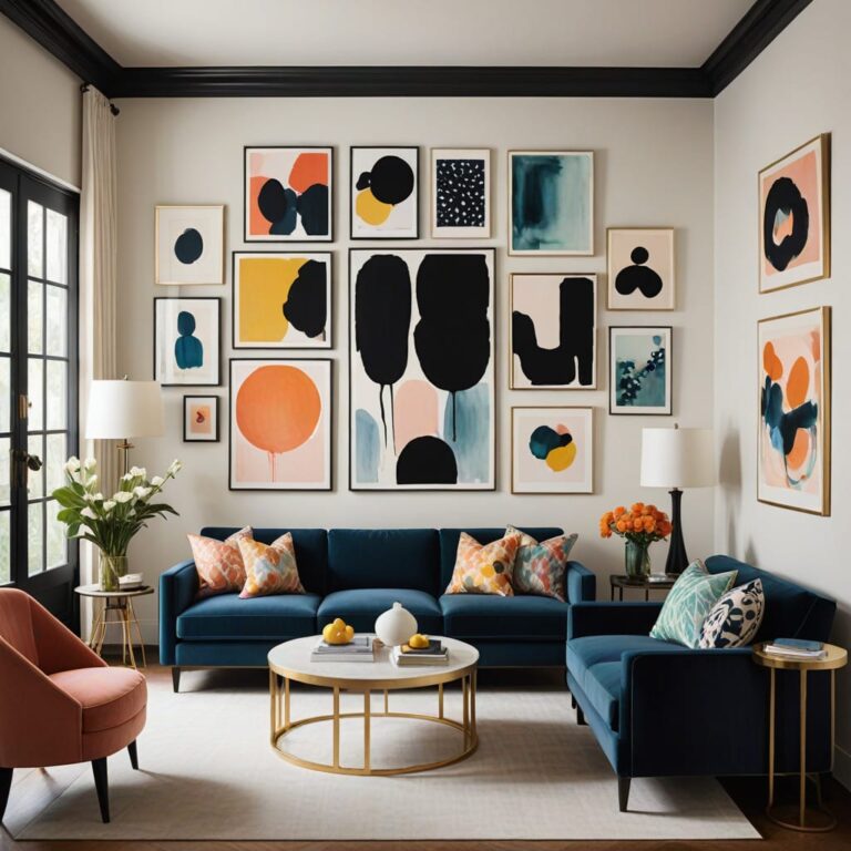
Discover the Best Paint Colors for Home Interiors
Choosing best paint colors for home interiors involves balancing style, mood, and functionality. Popular trends now favor neutral palettes like warm grays and soft beiges, combined with bold accent colors that add personality.
For inspiration, check out this guide on 7 Best Color Combinations for Room Paints to Transform Your Space to see how you can mix and match shades for a stunning result.

How to Pick Wall Colors That Suit Your Style and Space
Choosing paint colors can be intimidating if you don’t know where to start. Here’s a step-by-step approach to help you master how to pick wall colors that complement your home’s personality and architecture.
Step 1: Assess Your Style Preferences
Are you drawn to classic, modern, rustic, or eclectic styles? Your paint colors should reflect your personal taste. For example, modern interiors often use cool tones like grays and blues, while rustic homes favor warm earth tones like browns and greens.
Step 2: Consider the Existing Elements in Your Home
Look at your furniture, flooring, and decor. Neutral walls often provide a versatile backdrop that allows furniture and art to shine. But if your furnishings are neutral, don’t be afraid to introduce color on your walls for added vibrancy.
Step 3: Create a Color Palette
A balanced color palette typically involves three colors:
- A dominant color (often the wall color)
- A secondary color (for trims, accent walls, or adjoining rooms)
- An accent color (in furniture, textiles, or decor)
Using a color wheel can help you find complementary or analogous colors that work well together.
Step 4: Test Paint Samples
Always test samples on your walls before committing. Paint a small section and observe it at different times of the day to see how light impacts the color.

Choosing the Right Paint Shade: Tips and Tricks
Choosing the right paint shade isn’t just about liking the color on the swatch — it’s about how it interacts with your space.
Use Light and Dark Shades Wisely
Light shades reflect more light, making a room feel airy and open. Dark shades can add drama and warmth but may make a small space feel smaller if overused.
Consider Undertones
Every paint color has undertones — subtle hues that affect its overall appearance. For example, a beige might have pink, yellow, or gray undertones. Identifying these helps you match your paint to your furniture and flooring.
Opt for Timeless Colors
Trendy colors come and go, but timeless shades like soft grays, warm whites, and muted blues stay in style longer and help maintain resale value.

Color Psychology for Home Decor: Creating the Right Mood
The science of color psychology for home decor reveals how colors influence emotions and behavior in your living space.
Warm Colors
- Red: Increases energy and appetite; good for dining rooms but can be overwhelming in large doses.
- Orange: Friendly and inviting; ideal for social spaces.
- Yellow: Uplifting and cheerful; great for kitchens or entryways.
Cool Colors
- Blue: Soothing and calming; perfect for bedrooms and bathrooms.
- Green: Balances energy with relaxation; works well in living rooms and offices.
- Purple: Luxurious and creative; best in moderation.
Understanding these effects helps you choose paint colors for your home that support your lifestyle.

Small Room? Here’s How to Use Light and Dark Colors Effectively
If you’re working with small rooms, your paint choices can significantly affect the space’s feel.
- Light colors such as soft whites, light grays, or pastels open up space by reflecting more light.
- Dark colors can make a room feel cozy but risk making it seem cramped. Use them on accent walls or in rooms with plenty of natural light.
- Consider monochromatic color schemes — different shades of the same color — to create depth without overwhelming the space.

How Lighting Changes the Appearance of Paint Colors in Your Home
Lighting is often overlooked but is a critical factor in how to choose paint colors for your home.
- Natural Light: Brings out the true color, but north-facing rooms receive cooler light, making colors look bluer.
- Artificial Light: Varies by bulb type.
- Incandescent bulbs add warmth.
- Fluorescent bulbs add cooler, bluish tones.
- LEDs can be warm or cool depending on their design.
Always view paint samples under your room’s actual lighting before making a decision.

Popular Paint Finishes and When to Use Them
Choosing a paint finish is as important as the color itself.
- Matte: Non-reflective, hides imperfections, great for ceilings and low-traffic areas.
- Eggshell: Slightly glossy, durable, good for living rooms and bedrooms.
- Satin: Smooth and washable, perfect for kitchens and bathrooms.
- Semi-gloss: Reflective and durable, ideal for trim, doors, and high-moisture areas.
- Glossy: Very shiny, used sparingly for accents.

The Best Paint Colors for Home Interiors in 2025
Trends evolve, but certain colors have proven popularity for creating warm, inviting homes.
- Soft Neutrals: Beige, taupe, warm gray — versatile and timeless.
- Earthy Greens: Olive, sage, and moss add nature-inspired calm.
- Muted Blues: Dusty blue and slate gray offer a modern, serene feel.
- Warm Whites: Creamy whites bring warmth without overwhelming.
- Bold Accents: Deep navy, charcoal, and terracotta create striking contrasts.
Using these as a starting point, you can mix and match to create your perfect palette.

How to Combine Colors: A Simple Paint Color Guide for Beginners
If you’re new to painting, here’s a simple guide to choosing the right paint shade combinations:
- Monochromatic: Different shades of the same color for a harmonious look.
- Analogous: Colors next to each other on the color wheel for a calming effect.
- Complementary: Colors opposite each other for dynamic contrast.
- Triadic: Three colors evenly spaced on the wheel for a balanced palette.
For detailed color combos that work beautifully together, check out the 7 Best Color Combinations for Room Paints to Transform Your Space.

How to Choose Paint Colors for Your Home: Balancing Trends and Timelessness
While trends can be exciting, choosing paint colors that stand the test of time is key for a lasting home aesthetic. For example, the current trend embraces nature-inspired hues and muted tones, replacing the loud, neon colors that were popular a few years ago. This shift shows how homeowners are leaning towards calming, versatile palettes that create cozy and inviting environments.
If you want to stay updated yet avoid frequent repainting, select colors that can blend with changing accents and furniture. This strategy aligns perfectly with the best paint colors for home interiors, combining both style and practicality.

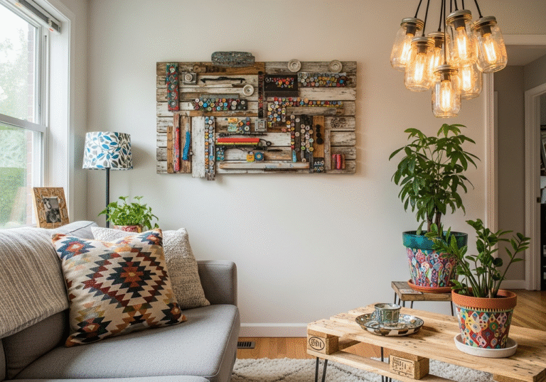
How to Use Accent Walls to Add Personality Without Overwhelming
If you’re unsure about committing to a bold color throughout an entire room, accent walls are a fantastic option. By painting one wall in a vibrant or darker shade, you create a focal point that adds depth and personality without overwhelming the space.
Accent walls are particularly effective in:
- Living rooms, to highlight a fireplace or entertainment center
- Bedrooms, behind the headboard
- Dining rooms, to add warmth and intimacy
When choosing your accent wall color, use the principles of how to pick wall colors by selecting a shade that complements the main wall color. For inspiration, the 7 Best Color Combinations for Room Paints to Transform Your Space is an excellent resource to find winning pairings.

Tips for Choosing Paint Colors When You Have Open-Plan Living Spaces
Open-plan layouts are popular but can be tricky when choosing paint colors. You want the flow to feel seamless but also distinct between zones like the kitchen, dining, and living areas.
Here are some strategies:
- Use a consistent neutral base across all walls to unify the space.
- Incorporate different accent colors or shades within each zone to define areas without breaking harmony.
- Consider subtle shifts in tone—like soft beige in the kitchen and warmer taupe in the living room—to create variety.
This approach makes choosing the right paint shade easier and helps maintain cohesion.

How to Choose Paint Colors for Your Home’s Exterior
Exterior paint color is just as important as interior paint. It’s the first impression your home makes and affects curb appeal and resale value.
Consider These Factors:
- Neighborhood Style: Choose colors that fit the architectural style and surrounding homes.
- Climate: Lighter colors reflect heat in warmer climates, while darker tones absorb heat in cooler areas.
- Materials: The color should complement brick, stone, or siding materials.
- Trim and Accents: Select colors that enhance features like shutters, doors, and trim.
Popular best paint colors for home exteriors include classic whites, navy blues, soft grays, and earthy greens.

How to Avoid Common Mistakes When Choosing Paint Colors
Even seasoned decorators can make mistakes. Here’s how to avoid the most frequent pitfalls:
- Skipping Paint Tests: Always sample paint in your room before buying large quantities.
- Ignoring Lighting: Remember that lighting changes how colors appear throughout the day.
- Overusing Bold Colors: Use bright or dark colors strategically, like on accent walls, to avoid overwhelming the space.
- Not Considering Finish: The finish affects how colors look and wear over time.
- Neglecting Cohesion: Ensure your paint choices work with your furniture, flooring, and decor for a harmonious look.
FAQs: Your Top Questions About How to Choose Paint Colors for Your Home
Q1: How many paint colors should I use in one room?
A good rule of thumb is to use two to three colors in a room — a dominant color, a secondary color, and an accent. This creates visual interest without clutter.
Q2: Can I mix warm and cool colors in the same space?
Yes, but balance is key. Using warm and cool tones together can create contrast and depth. Try anchoring with neutral shades to tie them together.
Q3: How do I know if a paint color will clash with my furniture?
Test paint samples against your furniture and fabrics under your room’s lighting. Also, consider undertones to ensure harmony.
Q4: Should I paint ceilings white?
White or off-white ceilings create height and openness. However, soft colors can add coziness, especially in rooms with high ceilings.
Q5: What paint finish is best for kids’ rooms?
Satin or semi-gloss finishes are durable and easier to clean, making them ideal for children’s rooms.
Final Thoughts: Mastering How to Choose Paint Colors for Your Home
Mastering how to choose paint colors for your home involves understanding the space, your style, and the psychology of color. By considering factors like lighting, room size, and mood, and using tools like paint samples and color wheels, you can confidently select best paint colors for home interiors that transform your space.
Remember to explore resources like paint color guide for beginners and tap into expert advice, including guides on popular color combinations. With patience and planning, your home will reflect your personality and feel like a true sanctuary.
Follow us on Pinterest

CreatBot D600 Pro 2 is a state-of-the-art industrial 3D printer designed for businesses demanding accuracy, dependability, and versatility in 3D printing devices. As part of the D600 series, it incorporates a large build volume, advanced dual extrusion technology, and high-performance features suitable for industrial use and complex materials.
CreatBot D600 Series Overview
The CreatBot D600 Series and D600 Pro establish benchmarks for large-scale 3D printers solutions. With a printing area of 600 ? 600 ? 600 mm, these industrial 3D printers cater to a broad spectrum of industrial 3D printing demands, from big model prototyping to end-use production. The D600 Pro lineup and the latest D600 Pro 2 introduce further improvements in performance and material compatibility.
Main Features and Benefits
Large Industrial Build Volume
Build size: 600 ? 600 ? 600 mm
Ideal for large-scale 3D printer projects and industrial 3D printing
Supports technical materials and intricate models
Dual Extrusion and High-Heat Printing
4th generation dual 1.75mm extruders for multi-material printing
Right and left extruder design for flexible printing
Supports high performance 3D materials, including PLA, nylon, carbon-fiber, and more
Maximum extruder temperature: up to 420°C (high temperature)
Heated build chamber for premium applications
Accuracy, Speed & Dependability
Professional 3d print quality with accurate layer resolution
Advanced motion system for fast printing and robust performance
Consistent print speed up to 120 mm/s
Reliable operation for continuous industrial use
Compatible Materials and Filaments
Wide Filament Compatibility
Works with a broad spectrum of filament types: PLA, ABS, PC, PETG, PVA, nylon, carbon-fiber, and more
Designed for engineering-grade materials and functional prototyping
Advanced dual extrusion system enables multi-material and soluble support printing
Applications: From Prototyping to Production
The CreatBot D600 Pro 2 model and D600 Pro serve a diverse set of applications:
Rapid prototyping and large format 3D print models
Functional parts for automotive, aerospace, and engineering
Tooling, jigs, and fixtures for industrial production
Art, architecture, and creative projects requiring large industrial 3D printing
Technical Specifications
Model: CreatBot D600 Pro 2, D600 Pro, D600
Build size: 600 ? 600 ? 600 mm
Extruder: Dual extruder, 4th generation 1.75mm dual extruders and hotends
Maximum extruder temperature: 420°C
Heated bed: up to 100°C
Filament size: 1.75 mm
Layer height: 0.05 – 0.3 mm
Supported materials: PLA, ABS, PC, PETG, PVA, nylon, carbon fiber, engineering-grade materials
Print speed: up to 120 mm/s
Enclosure: Heated, for improved material properties
Interface: Touchscreen interface
Supported file types: STL, OBJ, AMF
Comparison: D600, D600 Pro, and D600 Pro 2
Feature Differences
D600 model: Entry-level industrial large scale 3d printer for basic applications
D600 Pro: Enhanced with heated chamber, auto bed leveling, and wider material support
D600 Pro 2 model (professional version): Adds higher print speed, improved reliability, and HS (high speed) configuration
Additional CreatBot Printers
CreatBot D1000 for even larger build volumes
CreatBot 3D printer includes industrial and professional 3d printer solutions
Frequently Asked Questions (FAQ)
Compatible Materials for CreatBot D600 Pro 2
The CreatBot D600 Pro 2 is compatible with a wide range of filament including PLA, ABS, PETG, PC, nylon filament, carbon-fiber, and other engineering-grade materials.
What is the maximum build volume of the D600 Pro 2?
The printing volume is 600 ? 600 ? 600 mm, supporting large model and industrial 3d printing needs.
Dual Extruder and High-Temp Support on D600 Pro 2
Yes, it is equipped with dual extrusion technology and reaches up to 420°C for high-temperature printing.
What differentiates the D600 Pro 2 from the D600 Pro?
The Pro Version offers higher printing speed, improved reliability, and the new HS (high speed) option.
Conclusion
The CreatBot D600 Pro 2 and the CreatBot D600 Pro industrial professional set the benchmark in the industrial 3D printer category. With exceptional build volume, robust dual extruders and hotends, compatibility with technical materials, and high performance across applications, they empower businesses and engineers to achieve new heights in industrial 3D print.
[url=https://creatbotd6002.com]professional large format 3d printer[/url]
[url=https://www.creatbotd6002.com/pla]pla[/url]
[url=http://www.creatbotd6002.com/4th+generation+1.75mm+dual+extruders]4th generation 1.75mm dual extruders[/url]
[url=https://creatbotd6002.com]creatbot d600 pro[/url]